Saturday, January 30, 2016

Another Winsor & Newton Limited Edition

About two years ago, Winsor & Newton introduced a limited edition of 6 special colours - Desert series. From that collection, I've enjoyed the transparent orange and indian red deep.

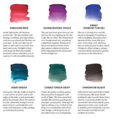
Winsor & Newton introduced another limited edition of 6 special paints they are calling the `Twilight Edition'. The colours are inspired by the romance and mystery accompanying the transition from day to night. Once again the paints are listed as Series 3 and are only available in 5ml tubes for a limited period. I believe that they are not available in North America yet.  Can't wait for them to arrive

What are we supposed to do if we really like these colours and want them to continue to be produced, especially if you are particularly taken by one or more of them?  For example, I'm a big fan of the transparent orange of the previous series and would love to have it as a permanent colour on my palette.

You might be lucky to get your hands on a dot card containing the six colours to try these out. The following dot card refers to the first limited edition but presumably Winsor & Newton will be providing one for the `Twilight' one.
 

The colours available in the latest twilight limited edition are:
  • Cobalt Green Deep
  • Aqua Green
  • Quinacridone Violet
  • Chrome Black
  • Sanguine Red
  • Smalt

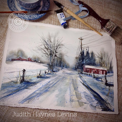
Today's artist find is Judith Haynes Levins
Judith Haynes Levins

Have a great week
Danielle

Saturday, January 23, 2016

Tips for painting blue skies

If you paint landscapes, you paint many skies.  Do you spend much time thinking about how to paint skies?

Choosing the right colour is one of the first steps.  Many of us are tempted to use blues out of the tube.  However, these are often brighter than the colours we actually see in the sky. Therefore, it is recommend that you gently mute the tube blue with a small touch of orange.

You also need to pay attention to how the colours change in the sky.  When looking up in the sky, you'll notice darker and more intense color saturation . As you start looking lower, the colours become lighter and are a bit warmer. How often have you admired oranges or pinks near the horizon?

In addition, you might want to infer a greater spectrum of light in the sky. To do this, you may want to place marks of two or three colors in close proximity to each other and allow them to interact on wet paper, e.g. blue, blue-green, and blue-violet. They all share blue in common, but also allow for a touch of yellow and red to be present. These marks will blend into each other lightly to create a solid blue sky that is more interesting.

Today's artist find is Xavier Swolfs:
Xavier Swolfs watercolour
Have a great week,
Danielle

Saturday, January 16, 2016

Selecting a paint manufacturer

Whether you go to the art store or shop online, you can't help but notice that there are a lot of colors to choose from and their characteristics vary by manufacturer.

Since most of us can't afford to buy every color in every brand, nor should we ever aspire to do so, there's a lot to consider when it comes to selecting which colours we want from what manufacturer. I don't believe that there is any right way to do this.  Have a look at the various successful professional watercolorists and you'll note that they all have their own personal preference for paint manufacturer.  However, all agree that it is worth the investment to buy artist quality paint from a reliable manufacturer.

Although the quality and characteristics of watercolour paint will differ between brands, this doesn't mean you can't mix and match. There isn't one brand that is the very best. Some manufacturers will excel at producing certain colors but disappoint with others. It really comes down to personal preference. I encourage you to experiment with different brands and see what strikes you.

Perhaps it's necessary to point out that just because paints from different manufacturers have the same index number it doesn't mean the shades will be identical. Pigment suppliers vary and it can happen that pigments from different sources, although supposedly the same, may well vary. In addition those like PV19 have a number of versions which is reflected in the finished paint. Another factor is how the paints are made by eack maker and what binders and other additives are used. I don't pretend to know the technical details and differences but they do exist.

There are many major manufacturers of watercolour paints (Windsor & Newton, Maimeri Blu; M. Graham, Daniel Smith, American Journey, etc.) around the world.  Selecting the best of breed is not easy and takes time.   Given the price of paint, I expect that many artists don't switch from brand to another enough to make effective comparisons. If you want to read up on the traits of different brands, here are two sources of information:
These resources may seem a bit dated. Does anyone have a reference that would be more recent?

This week's artist find is Mona Omrani:
Mona Omrani Watercolour
Have a great week
Danielle

Saturday, January 09, 2016

Creativity and Robert Gonsalves

I'm often impressed by the talent of some painters, regardless of the mediums. There are so many talented artists.

What's more impressive at times is the different ideas that some people come up with. Some people are extremely creative. 

Recently, I came across some photos of paintings from Robert Gonsalves. He has a fun way of twisting our perception and causing the viewer to question what if anything, is real in his paintings.

Most of his stunning paintings have an unclear boundary between the multiple stories they tell, which forces the viewer to jump back and forth between them – like an optical illusion that changes every time you look at it.


Take a look at nine of his paintings!
How does one get so creative?

Have a great week,
Danielle

Saturday, January 02, 2016

Taking reference photos for paintings

Ever since I got my digital camera, I've been taking thousands of photos. About a year ago, I started focussing on taking some photos specifically to paint.  I made a number of mistakes and through this blog, sharing them so that hopefully some of you might not make the same ones.

Here are some of the lessons I've learned:
  • Take the  time to position or remove objects: I love flea markets and wanted to paint some interesting topics, especially blue glass jars.  I've learned that I may need to remove objects that I don't want in front of main topics. Otherwise some of those objects will upset the composition.
  • Take photos from all angles including straight on and from the side.  Even if I think that I have taken the best shot to paint, sometimes when I look at the photo when it's time to paint it, the layout and composition may not work. It's often not possible to go back to take another photo, so even if you think you have enough photos, take more. I've learned to walk around the subject and consider all angles. Taking photos from different views includes not taking all photos at eye level.  You'll be able to select the best view once you get back home.
  • Conversely, some times, there are better angles for certain topics.  Take for example, creeks with small waterfalls. I have many many photos take from the side and from the top of a waterfall.  I've learned that this topic is more appealing in a painting when the water flows toward the viewer.  I've learned to go down stream and look for places to take these photos.
  • For larger scenes, it's instinctive to want to capture the perfect photo.  Instead, you might want to take photos to capture the movement and the essence of the moment.
Even with decent photos, you can't always rely on using the photographs as is for a reference.  Often time you might have to make a some changes to the compositions. That's a whole different topic.

Today's artist find is Terry Armstrong:
rry Armstrong watercolour

Happy New Year and have a great week,
Danielle